Wednesday 30 January 2008

Jacques site

I thought the home page looked a litle dull so I added some links, I did this by creating a text box and then highlighting it, finding the site I wanted and copying the site address into the link box.


I thought this would be usefull for my Jacques biography may inspire people to read on and find out more about him.

Tuesday 29 January 2008

Animation Lighting


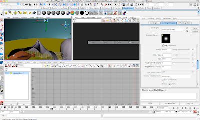
My piece was looking a bit plain so I added some lighting, I did this by going on create light, then there's different types of lights which you cand adjust to suit the mood, the sets quite light with shadows around edges (this is to convey the sadness at the end). I viewed the end render in render view. I was pleased with the impact the lights had on my piece!
Analysis of article,

Digit magazine , Designing for Charity,

The main content of this article is a review about the way designing for charity has changed,. The article states that although there have been recent shock campaigns (Sophie Ellis Bexter holding up a skinned fox etcet) the knew way is done using celebrities , though now they use provocation eg the rather go naked then wear article. The coorperations now use provocative imagery to get people too give there cash. The article is saying things have rather gone the opposite, rather then offend people they give people what they like. It also mentions the health bands which celebrities would wear to proote buying them. The layout of the article is quite niece, though not as exciting as some (but who'd expect it to be, with the content), I did find it quite interesting though I couldn't relate to some of the knew methods, for that rather go naked then wear fur may have been easy on the eye, but it never made a statement that really struck me.

Games tm Magazine, Halo 3 review,

This is a pretty typical "games" article on Halo3, it goes through the good points first such as smarter enemys, knew weapons and advanced online play. The magazine the then goes onto talk about the bad points such as hardly improved graphics (for such a big game) , a small campaign mode and the crap plot. Then it goes back to the online features and back to how great it is and how it delivers on most levels to reach a 9/10 rating. This article was laid out niecely , formative and read very well aprt form being a litle predictable it was an niece easy read.

COmputer arts, XSI Foundation 5.0 program review,

This was just a short review of an animation program I read, this litle review does alot to sell it to me I have to say, it states that in comparison to other programs of its £299 price range it is a Maserati, where as they are Citroesns (quite a metaphor, useful to a person who doesnt know much about these programs), it states other more expensive programs may do less , but be easier to use so , taking that into account I know which program I'd be using. This review I found was helpful and grabbing a niece bit of info.

One last touch


I added a Motion Blur here at the end, I did this in render setting, partly because I felt it didn't seem underwarter enough and I thought this would help that effect. I also selected the cameras and what times they were displaying in this box. I did each camera scene seperate, the merged them together in final cut pro. I think next time it may be better if I could, of made warter or Bubbles in the air!.. oh well

Monday 28 January 2008

Jacques site


For the background in Jacques sit I used the main imagery from the magazine on too different web pages, I cut the images out, put them on an 800/600 page, filled the text area with black and changed the colour mode to RGB so that it would work in Dreamweaver. I left alot of space for the text and dragged the backgrounds (saved as Jpegs into dreamweaver) I then added the text.


Text added,


Im quite pleased with these pages, they are clear and easy to understand and you can tell the site is linked to the magazine article. though I'm not to keen on thge main title font and the homepage looks a litle plain.

Wednesday 23 January 2008

The text

The text is just after here, I couldn't find any books on Jacques so most of the information was found on websites, and general knowledge, all though I did watch a BBC series which once featured him and is now on youtube!

I think that its a good summary of the mans life, it shows his achievements, his interests and attitude, at a very readable level.Its an acumilation of knowledge I'v gained from various sites (Belgian porp rock archives and youtube videos) I also learned alot from a BBC documentary and he is mentioned in David Bowie's biographys as an influence.


Jacques Brel was Belgian-French speaking singer , born in 1929. His farther owned a cardboard box factory , of which Jacques was supposed to take over. Though Jacques showed no enthusiasm for this and joined a Catholic-humanist youth organisation , where he met his future wife Therese Michilesen. At this group he sang and took part in plays and in the early 50’s he released a single (La Foire/ll ya). Then in 1954 he quit the factory and whent to pursue a singing career. Though Brel had some set-backs on the way , one musician claimed it would be better if someone else sang his songs , for he thought Jacques couldn’t sing and was too ugly. Though this didn’t stop Jacques who by 1956, was touring Europe.
Sadly Jacques began to spend alott of time away from his family as his success increased. This was due to his passionn and dedication, to living his dream.

As Jacques progressed and met knew musicians , his musical style progressed and grew deeper. Jacques later tracks seem to have much more power and diversity then his earlier pieces. Jacques is regarded as an exquisite poet/lyricist, for his choice of words and the depth of his meanings . Jacques songs range from being loud, hilarious and satiric , to being slow, moving and heartfelt. His songs seem to poccess energy and drama that wasn’t common in music during this time. To emphasise this Jacques didn’t perform like any average singer, he seemed to enjoy acting each song out, playing every character.

Though in England and America Jacques Brel isn’t well known , he is still remembered as a Classic/Legend in France. In Brussels there is Jacques Brel Metro station and a Jacques Brel theatre, where young performers inspired by Jacques go to perform. Though Jacques is relatively un-head of in England there have been some famous versions of his work Terry Jacks version of “Seasons In The Sun” topped the charts (though it was a very tacky version of the original), Dusty Springfield covered “If you go away” and David Bowie covered “My Death and ”Amsterdam” early on in his career. So it can’t be said that Jacques influence didn’t spread around. Jacques finished his singing career after 15 years.

Upon announcement of Jacques retirement he was asked “Don’t you feel your abandoning the French people?, to which Jacques replied ”When I started singing nobody wanted me to start, then I stop and every one wants me to carry on!”. Though Jacques did quit singing his songs he went into recording and meticulously whent about recording all his songs. Jacques then went into film directing and even acted himself in couple. He also acted in plays for a few years. Though Jacques had a pilots license he also enjoyed sailing and in 1973 bought a yacht, planning to sail round the world, though when he reached the Canary Islands, Brel was diagnosed with lung cancer (Jacques had always been a heavy smoker). He died in 1978. Though his memory still lives on in theatrical productions and in the minds of musical conneseurs.

Sunday 20 January 2008

adding imagery

I knew it was looking rather dull on the left side, there was no main feature so choses to use big polaroids with iconic pics of Jacques to make it more interesting.


To make the Polaroids on the left look more interesting I also added a bevel that faded into the blackness, I also put a slight white gradient going through the middle to make it look like the page was lit up like how Jacques used to be.
To make the images fit the polaroids and the background I had to play with levels.

I think the black and white contrast works really well so far. It gives an interesting perspective on the time period and fashion back then.

Friday 18 January 2008

Camera's!


I just figured out how to create camereas and make them move with the fish, this i think should help with making my animation look more 3D and interesting. To make the cameras move with the fish I selected them, keyed them , moved the frames along then moved them along again and key framed them again.

Thursday 17 January 2008

Making the border

I wanted to use a rather flashy border for this Jacques piece, to achieve a similar affect as the mojo magazine heres what I did.

I decided I wnted to use Polaroid kind of old fashioned shots, as they had just came arund at this time.

So first I whent into illustrator and made a brush.


I first made the basic shape and colour of a polaroid picture.


I then duplicated it and clicked on create scatter brush, and adjusted the setting until I found something I liked.

I then created my double page spread page and drew these polaroid patterns around it for a border.

Mojo mag


Heres a rather interesting spread from Mojo, I like how the texts surrounds the image but doesnt over crowd it. The colours work well together too and the text fits the imagery really well! I'd like to maybe use some of these elements , though this will depend on the way my article looks!

Wednesday 16 January 2008

Research for the website


I looked at a site for the magazine uncut to see how websites related to articles, you can see on this article that the uncut werbsite format is very similar there mag format. So maybe I should think about doing the same with my website.

Monday 14 January 2008


This is a scan in from mojo magazine, this isn't the best representation of aspects I would like to have implemented in my magazine (this is because currently I don't have access to a scanner). The things I like about the "Uncut" and "Mojo" magazine's are the way there spreads have a theme, you can see in this one that they have chosen to do an old fashioned article style. The way the text works with the borders is really niece, the border in perticular, I think adds alot of character to this page. The colours also work well toether, though I dont think the imagery works well with the spread, for the theme is classy and quite elegant, but the picture is of a modern prick craving attention in the most annoying way. The content of this magazine bores me, but the style and layout are niece. A themed style I think, will work well for Jacques, maybe Black, White and Gold with caligraphy writing, anyway we'll see.

Animation Development


Sometimes whilst animating if I did a turn using key frames , the turn would go wrong shaped and I 'd have to mess around with the bars at the bottom and fiddle with them until he turned cleanly.

Back To Jacques

For one of my latest briefs I'v been asked to create an article , with my own text. I've chosen to do this on Jaques Brel (I did a psot on him a coupe of months ago). He was a Belgium , who sang in French , from 1940 to the late 1960's . In England he isn't very well known, though in France he's quite a Legendary icon. There's a Jacques Brel station on the Brussels train line (Brel lived there for a long time and even wrote a song called "Brussels"). Jacques music for his time was rather wild , unlike most of the mainstream performers Jacques didn't conform to the subdued style that was common in that period. Jacques would act out his performances with an ever present flaming vigour , his views both political and social, emphasised in pure poetry. Edith Piath recognised Brel's performing brilliance .

"He goes to the limit of his strength because, through his singing, he expresses his reason for living and each line hits you in the face and leaves you dazed." Edith Piath On Jacques Brel.

I'd like to create a rather classy double-paged spread for this piece , using iconic imagery of Jacques (I may edit these or use natural pictures). My double page spread should be appealing to an older and younger audiance (like something from rocksound or uncut)

Below is an example of the imagery I'd like to incorperate , you can see from this picture the expressive nature he has.

Saturday 12 January 2008

Models, set and {ainting


I modeled the Fish using the extruding faces technique and then smoothing it at the end, I added the eyes by adding a sphere to it then paretning it with the body, I couldn't create the warter effect very easily so created a large nurb sphere, put a floor surface down then pianted it. The paint tools are easily useable for you create , your colour then, you can play around reflectivness and opacity etcet, I gave my gold fish a shine! You can drage the colours on with the middle mouse button or paint different sections with the section shader.

Grrrrreat!

Thursday 3 January 2008

Jacques mag research


Heres a double page spread , I found on the net, it seems to use a large image on the left and then text on the right is a good method to draw attention to the theme of the article, I may well use this kind of thing in my double page spread. The text is quite subtle, with the title above it. This is a very modern style , I like it alot±!.